Overview
Transforming a Limited Website into a Trustworthy, User-Centric Platform to Drive Growth
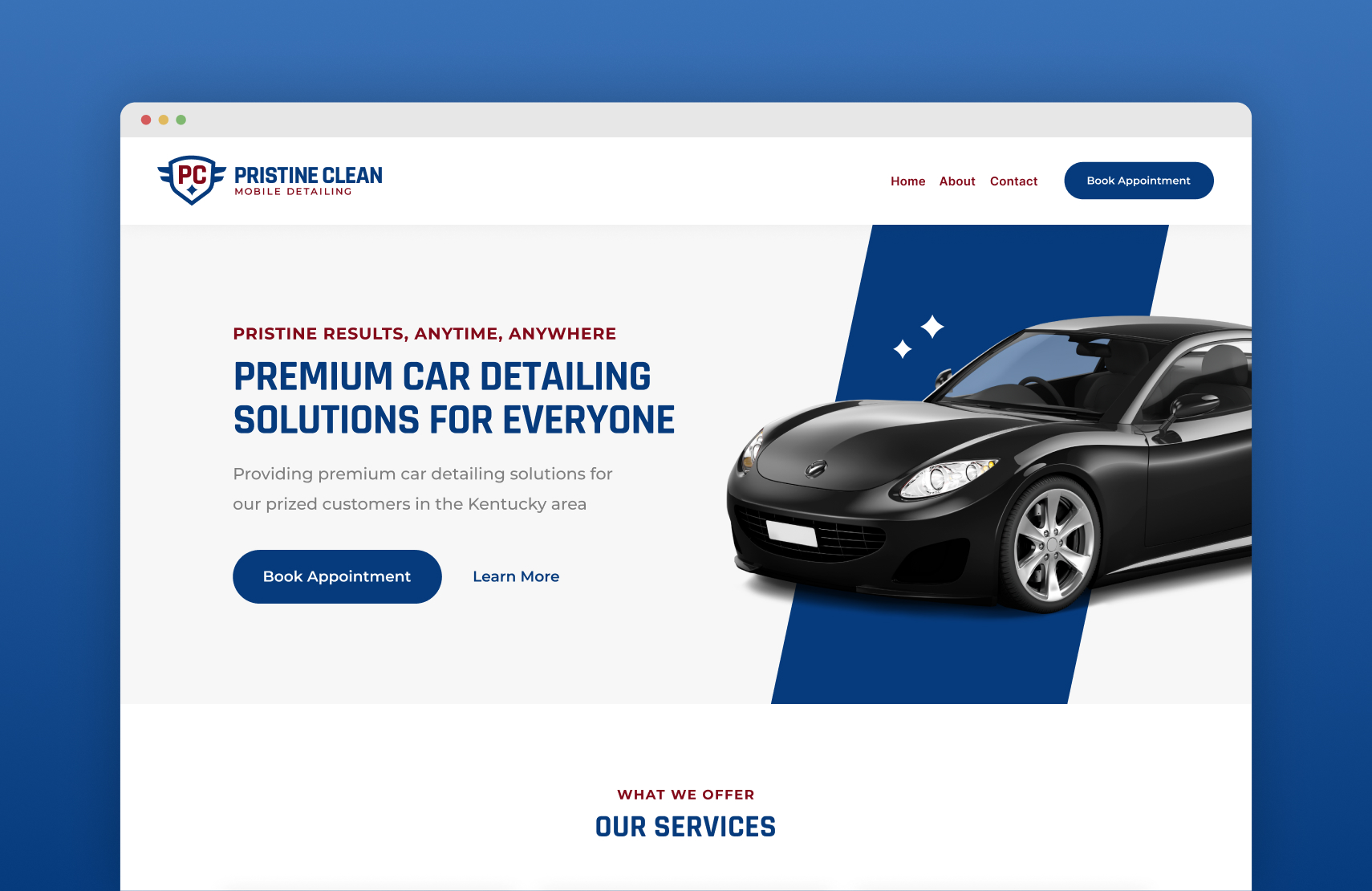
The website for Pristine Clean was functional but lacked depth, transparency, and modern branding to build trust and engage customers. I redesigned their one-page website into a comprehensive, professional, and user-friendly platform. By highlighting detailed service information, authentic reviews, and the company's mission, the new design aimed to elevate the brand’s credibility and appeal, ultimately driving growth through a more effective digital presence.
Timeline
1.5 Months
Platform
Website
My Role
Product Designer
Graphic Designer
My Role
As the lead UX and Graphic Designer, I redesigned Pristine Clean’s logo, branding, and website from scratch. I worked with stakeholders to conceptualize, design, and hand off the project for development.
Problem Statement
The Website was Outdated and had Minimal Content Failing to Engage Customers and Build Trust
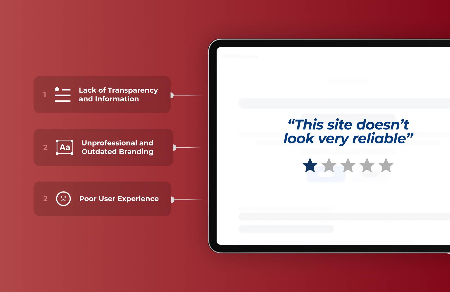
Lack of Transparency and Information
The original website provided minimal details about services, pricing, or the company’s values, leaving users uncertain about the business's offerings and credibility.
Unprofessional and Outdated Branding
The simplistic design failed to establish trust or reflect the quality of services Pristine Clean offers, deterring potential customers.
Poor User Experience
Limited navigation and content made it challenging for users to find relevant information ultimately reducing engagement and conversion opportunities.
Goals
Enhancing Transparency, Professionalism, and User Experience to Boost Conversions
Enhance Transparency and Build Trust Through Detailed Information and Reviews
By providing comprehensive service details, showcasing authentic customer feedback, and articulating the company’s mission, the website will be a reliable and informative platform that reassures potential customers.
Elevate Branding to Reflect Professionalism and Service Quality
A refreshed brand identity and visually appealing design will position the business as a trustworthy and high-quality service provider, resonating with customers seeking premium auto detailing.
Streamline User Navigation to Improve Engagement and Drive Bookings
Simplified navigation and strategically placed calls-to-action will ensure users can easily find what they need, encouraging deeper engagement and conversion.
The Solutions
Designing for Trust, Simplicity, and a Bold Professional Presence
After researching to define our problem statement and goals, we set out to craft design solutions that resolve our problems, exceed our goals, and deliver an exceptional, user-friendly experience to potential customers.
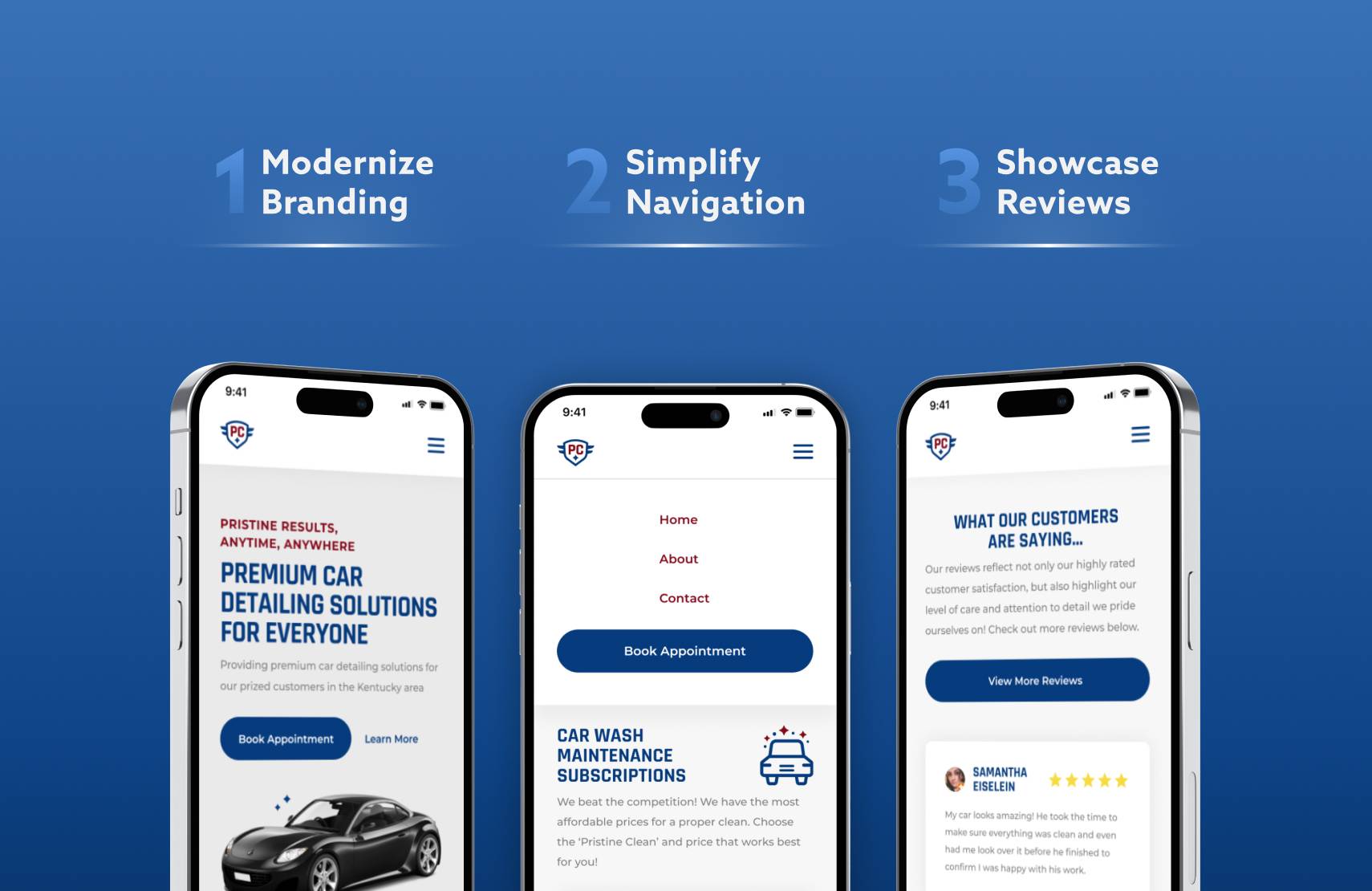
Modernizing Branding to Reflect Professionalism and Quality
Implement a clean, cohesive design using modern typography, a professional color palette, and high-resolution imagery to create a polished and trustworthy aesthetic.
Simplifying Navigation to Guide Users Seamlessly to Bookings
Design a user-friendly layout with intuitive menus, a clear hierarchy of content, and bold, strategically placed call-to-action buttons to ensure effortless navigation and engagement.
Showcasing Services and Reviews to Build Trust and Transparency
Include service cards with clear descriptions and pricing alongside a dedicated reviews section featuring customer testimonials and ratings to relay authenticity and transparency.
the research
Conducting In-Depth Research to Deeply Understand User Needs and Behaviors
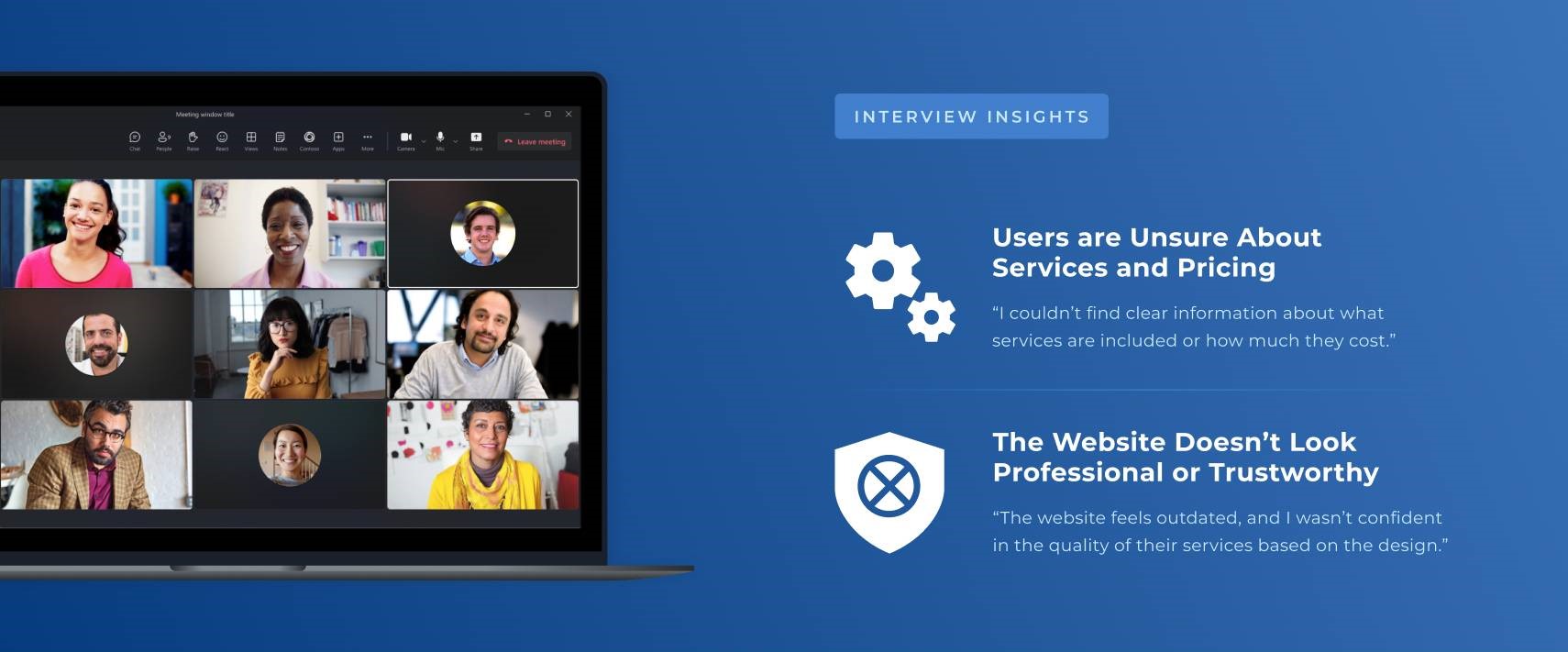
I conducted user interviews, surveys, competitive analysis, analytics reviews, and more to inform our problem statement, goals, and design solutions. By doing in-depth research into our target audience and their needs, we were able to uncover valuable insights.
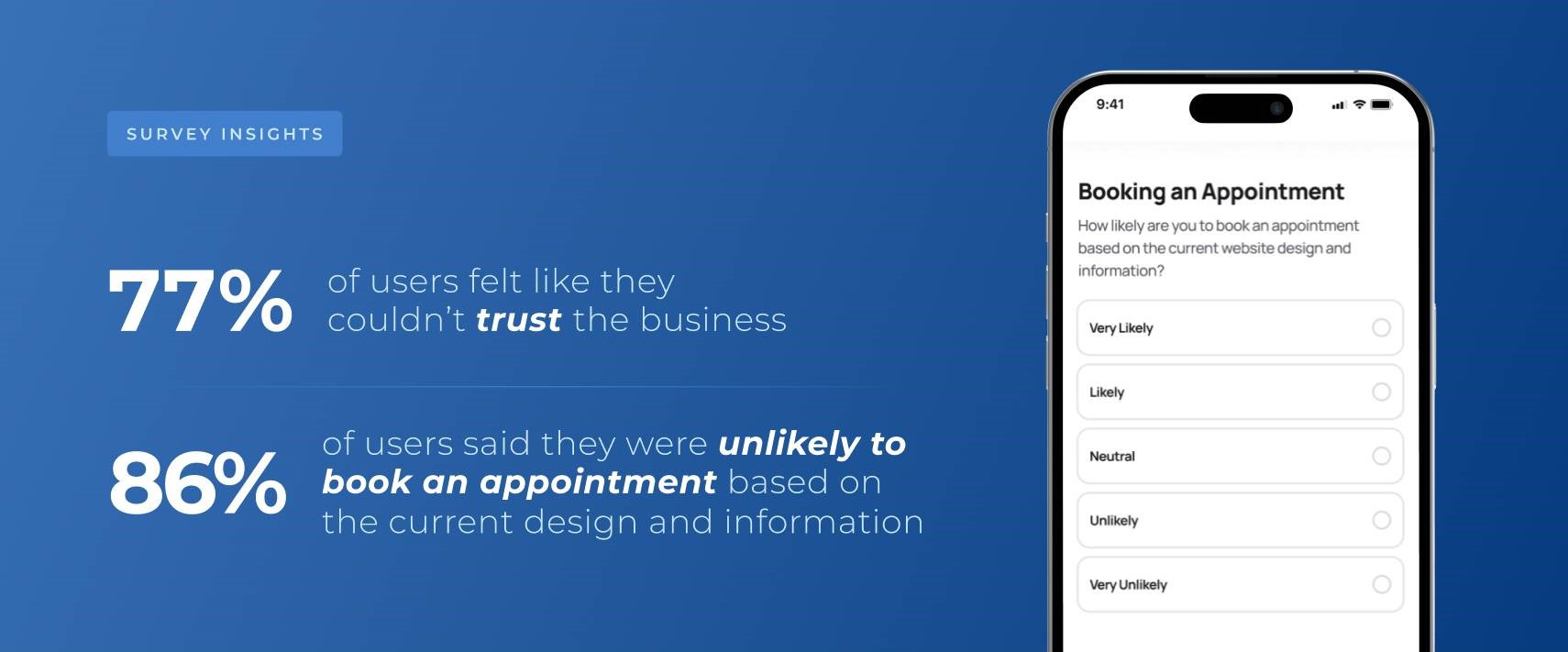
Clear Service Information and Transparent Pricing Are Crucial for Building Trust
Users are looking for detailed, easily accessible service descriptions and transparent pricing, as ambiguity can lead to frustration and distrust, directly influencing their decision to engage or book services.
Professional Branding and High-Quality Visuals Establish Credibility
Competitors with modern, cohesive branding and high-quality visuals are perceived as more trustworthy and professional, which is critical for attracting customers who are willing to pay for premium services.
Seamless, User-Friendly Navigation Drives Engagement and Conversions
Complicated navigation and difficult booking processes discourage users from completing tasks. An intuitive, streamlined layout with clear calls-to-action ensures users can easily find information and book services, improving overall engagement and conversion rates.
Design Process
Creating a Brand and Design System that Builds Trust and Increases Conversions
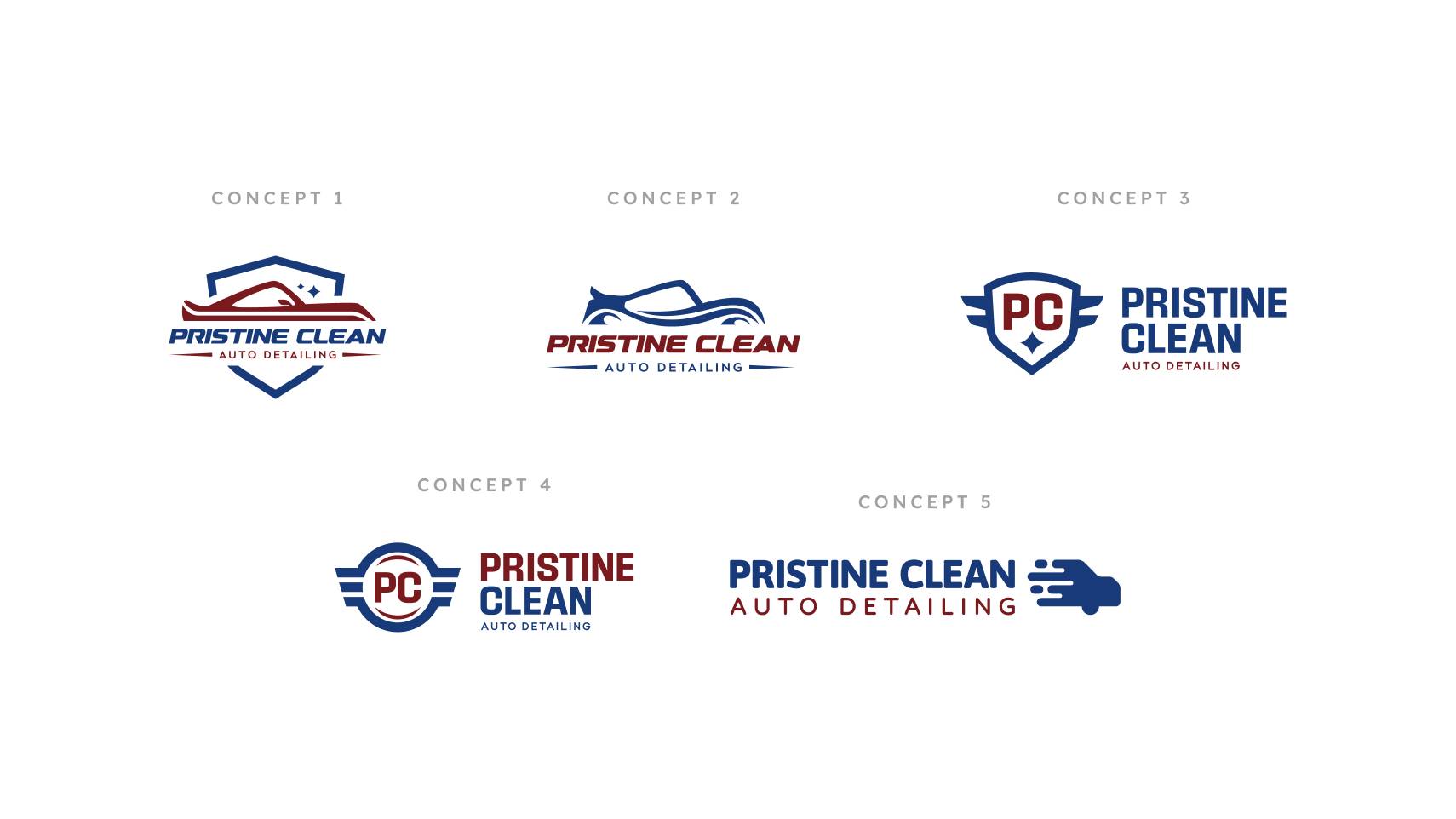
After conducting research and defining key problems and goals, I set out to redesign Pristine Clean’s branding. Meant to evoke a sense of professionalism, trust, and high-quality services, I sketched, vectorized, and proposed five concepts that were narrowed down to the final logo and branding showcased on the website and all things Pristine Clean today.
Finalizing Branding to Create Lasting Impressions
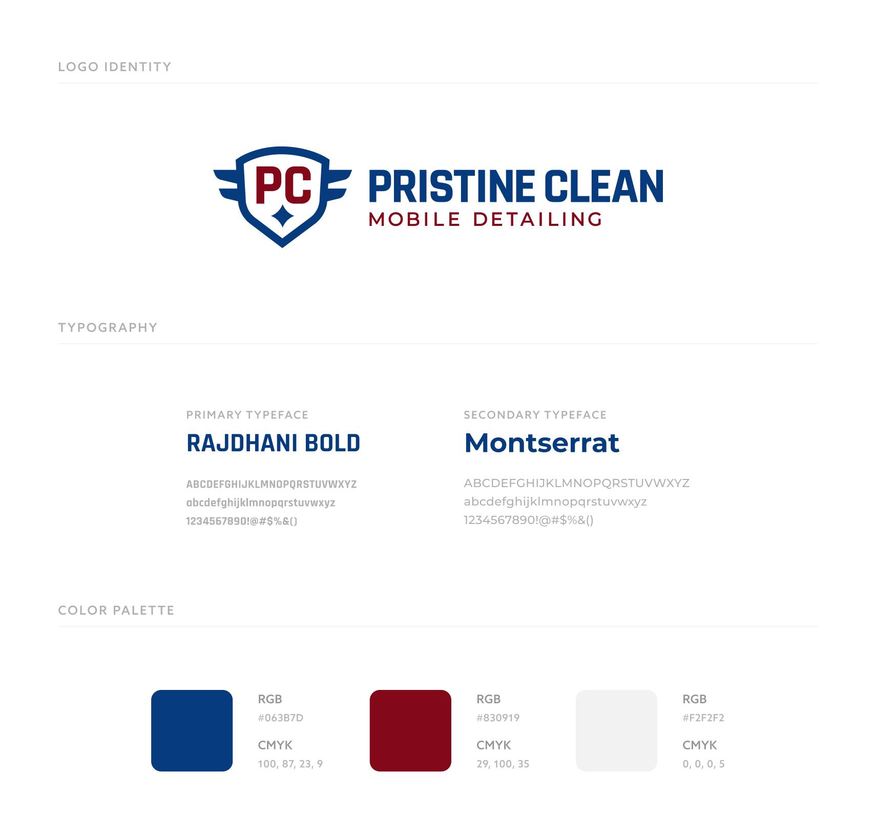
After much discussion, the final logo and branding were chosen to be implemented into the new website. The business prioritized branding that felt high-quality and professional while giving a sense of patriotism and friendliness.
Building the User Interface Around the Brand, Research, and Goals
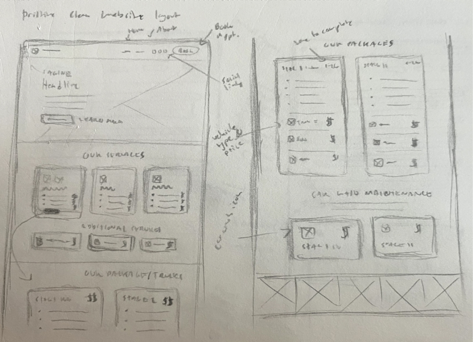
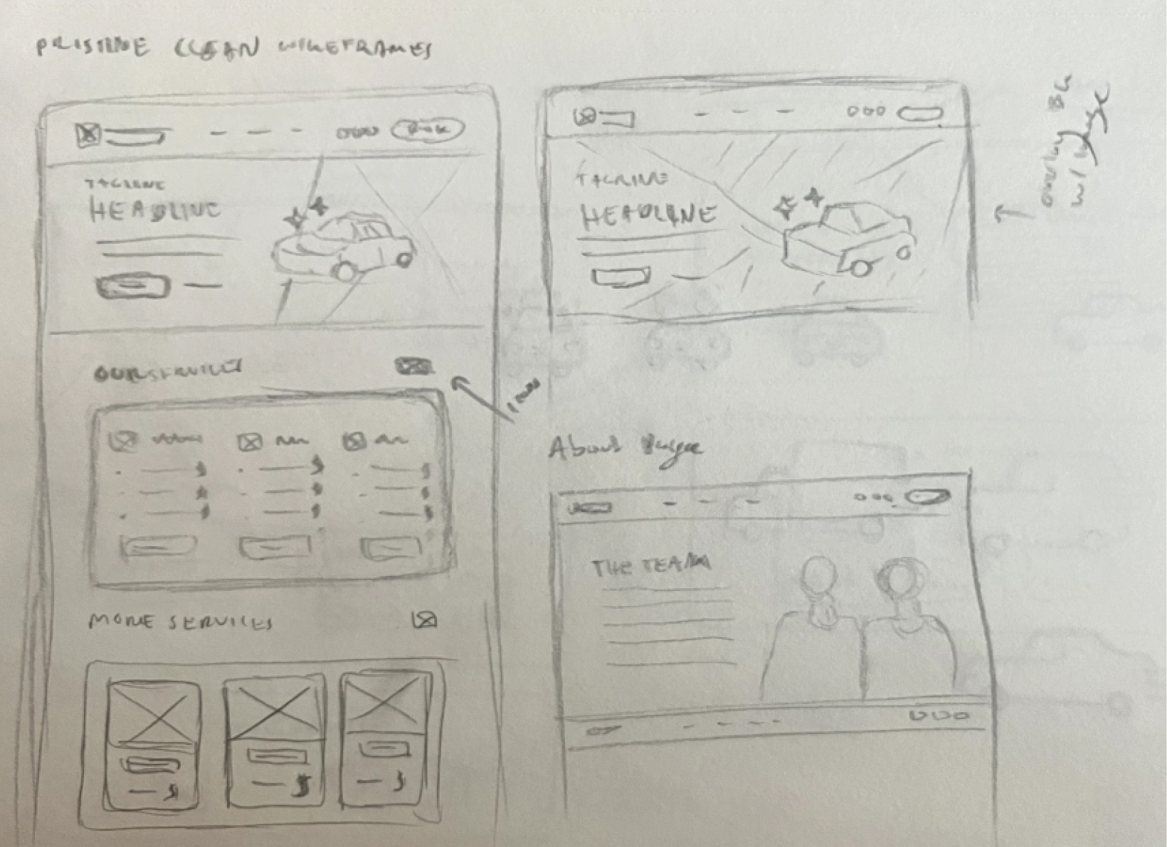
After finalizing the branding, I started sketching low-fidelity wireframes to lay out the proposed content for desktop and mobile. Some ideas got scrapped that didn’t fully align with our research and goals while others got upgraded into high-fidelity wireframes to be reviewed in-depth.
The Not so Final, Final Product
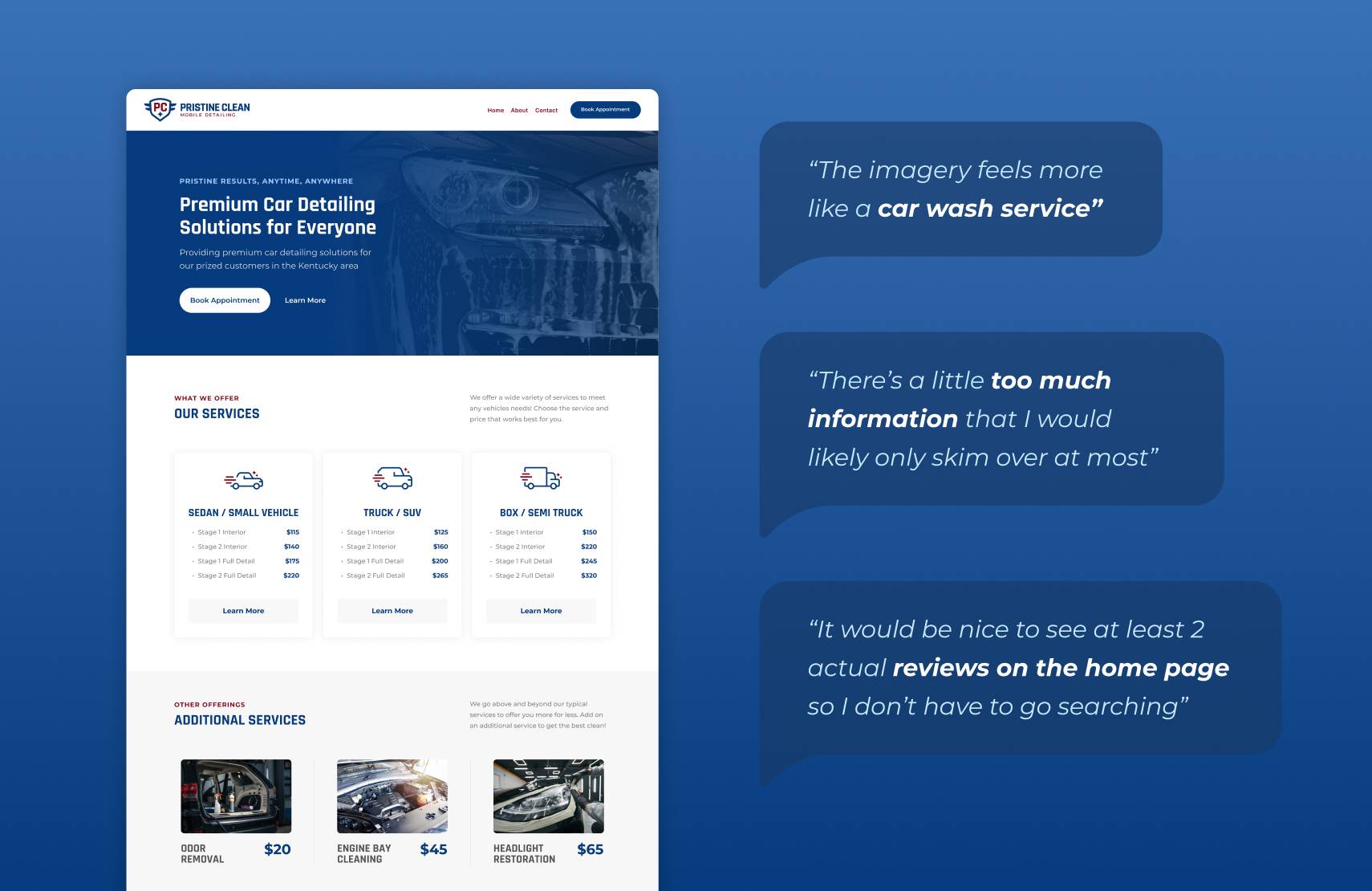
After creating high-fidelity wireframes which were some of the first ‘final’ drafts, I was able to conduct more user testing to better understand how the audience would engage with the interface. Based on user feedback, we were able to update, adapt, and create a better, more engaging interface.
The Final Product
Delivering a Final Product Through Thoughtful Design and Strategy
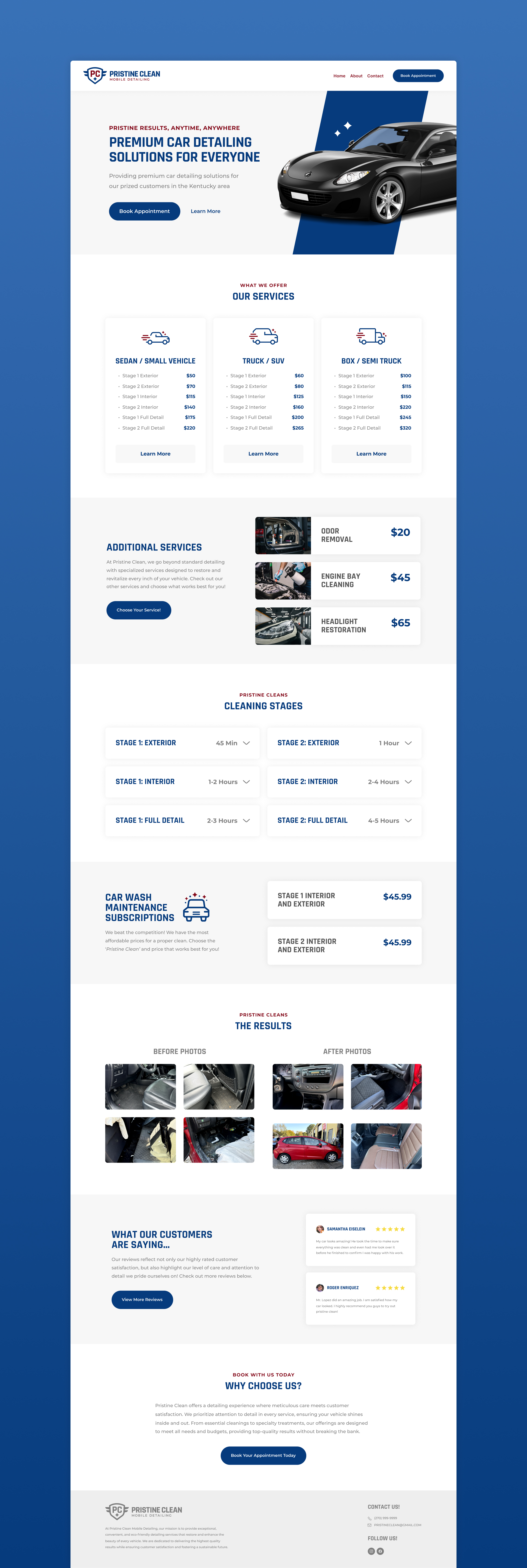
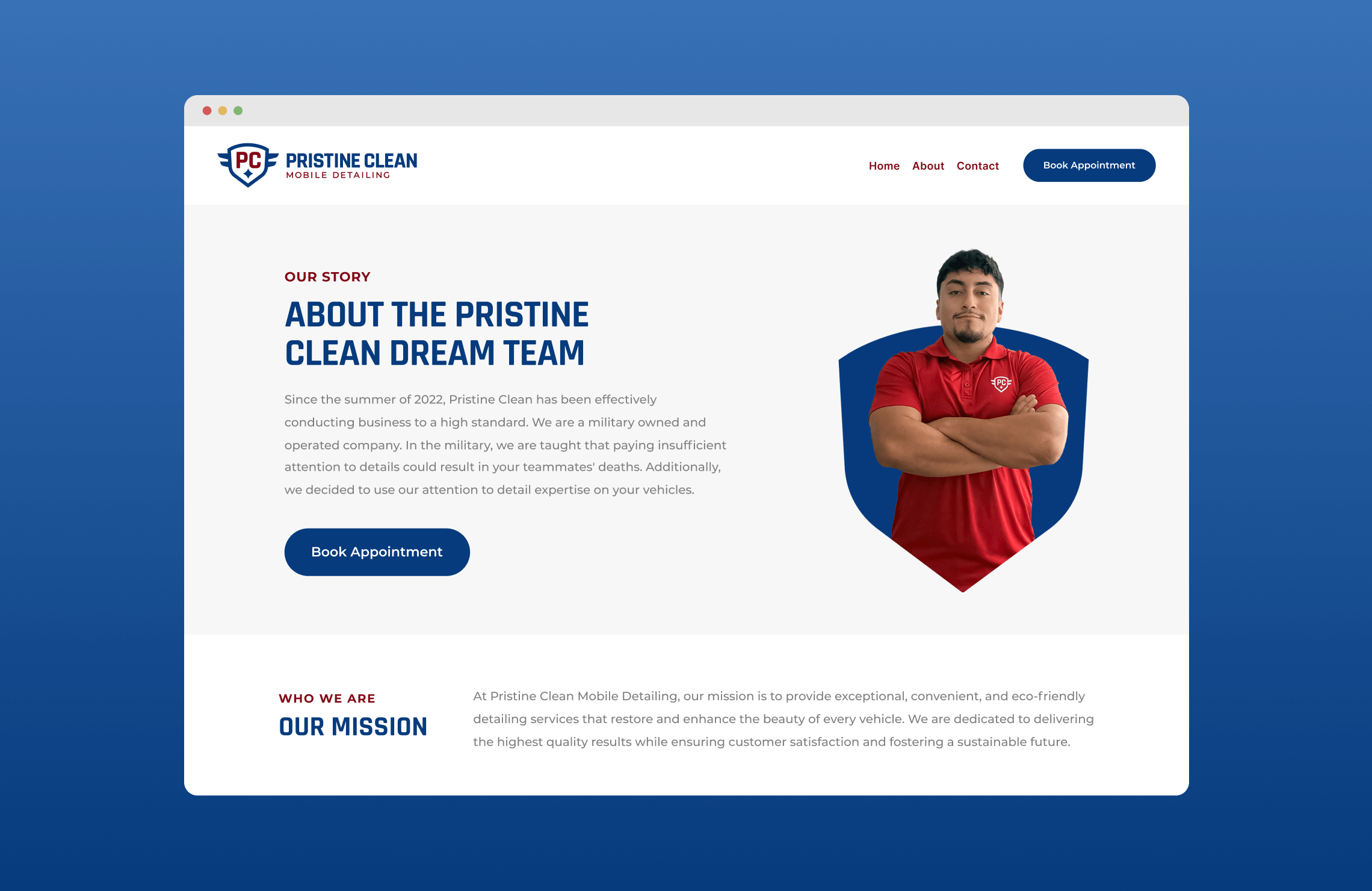
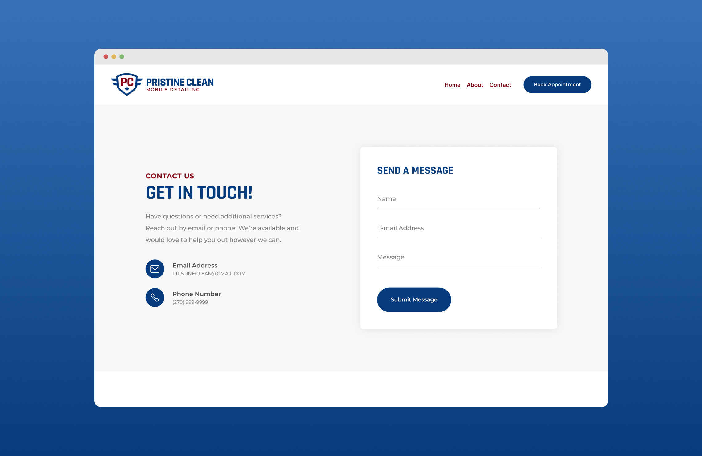
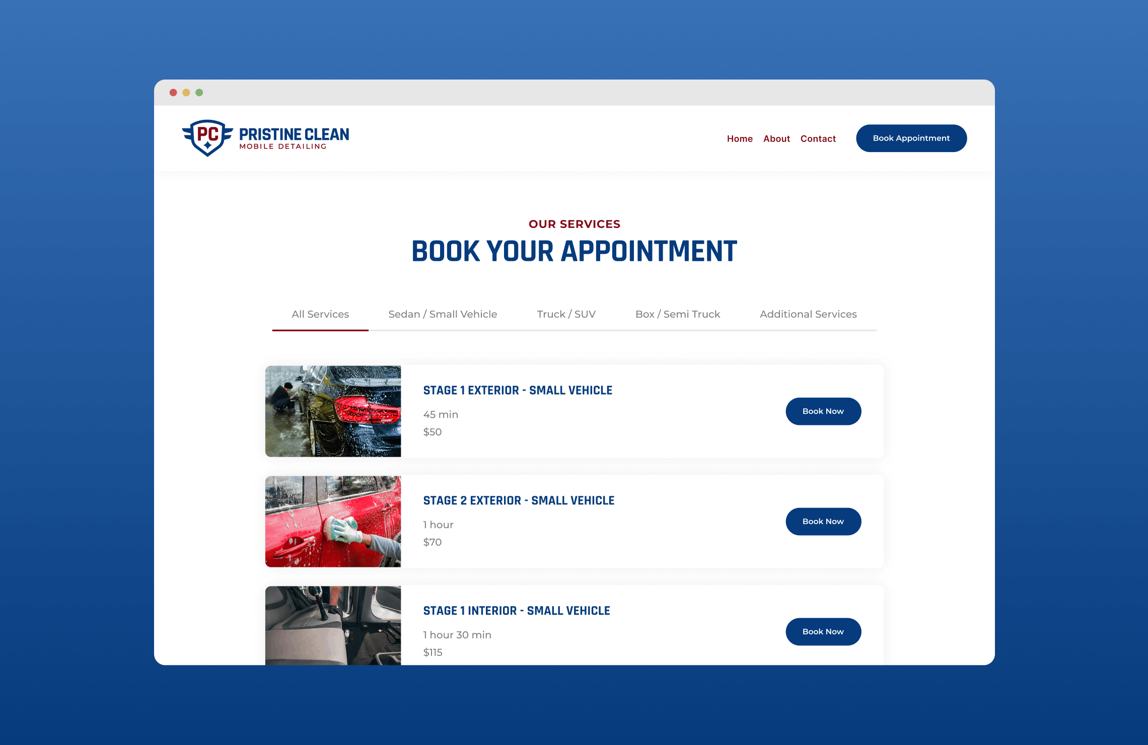
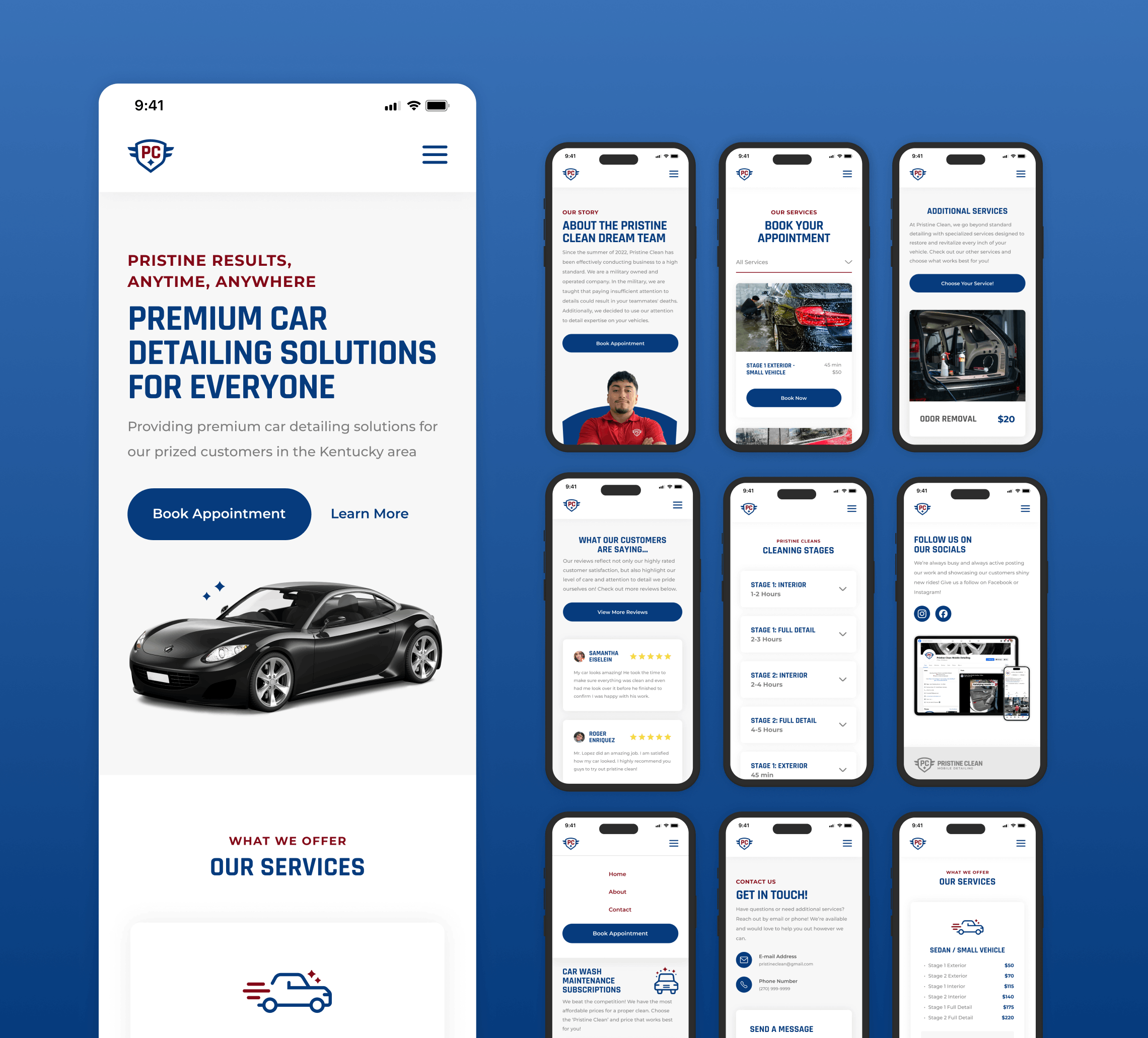
After trial, error, and many revisions, I delivered a complete brand and website overhaul that met business and user goals, addressed key problems, and ultimately increased conversions and brand recognition. I present to you…Pristine Clean’s new interface!
Note: The live site has been altered post-hand-off to development due to development constraints and business changes. The below images are the final, approved redesign.
The Results
From Outdated to Outstanding: A Professional, User-Friendly Website That Drives Results
Increasing Conversion Rate from 3% to 8%
After implementing clear calls-to-action and simplifying the booking process, the website's conversion rate for service bookings increased from 3% to 8%, driving more revenue.
Reduced Bounce Rate from 45% to 25%
Pristine Clean’s new mobile-optimized website reduced the bounce rate from 45% to 25%, ensuring more users stayed and explored the services offered, leading to a greater chance of conversion.
85% of Users Were Highly Satisfied
Post-development surveys revealed that 85% of users were highly satisfied with the new design, features, and transparent and professional look and feel of the interface.
Future Steps
Conducting User Research, Monitoring Key Metrics, and SEO Improvements
Although after the final design was approved I no longer had any UX involvement with the project, I’d recommend a couple of key steps to take to ensure the website continues to meet user and business goals and increase conversions.
Continuous Usability Testing
Gather user feedback consistently to identify unforeseen issues and update where needed.
Monitor Key Metrics and Analytics
Continue tracking key metrics like bounce rate, conversion rate, time on site, and more to measure the design’s impact and inform future updates.
Improvement of SEO Content and Strategy
Integrate UX improvements with an SEO strategy to drive organic traffic and ensure the design supports discoverability.
Reflection
What I Would’ve Done Differently
Although my role in this project yielded meaningful results, there are a few things I’d do differently if I were to start from scratch again.
Designing with a Mobile-First Approach
Further research and analytics revealed that most customers were visiting the site on mobile devices. While this wasn’t revealed at the time, doing additional research and designing with this in mind would have been beneficial.
Recommend Content Updates to Bolster SEO
While lots of the content was suggested and implemented by myself, I believe doing an even deeper dive and more formulating review of an SEO strategy could have yielded even better results.
Implementation of Micro-Interactions
Although there were time, budget, and development constraints, I would have loved to introduce more micro-interactions to give the interface some more personality and make it stand out from its competitors.
